
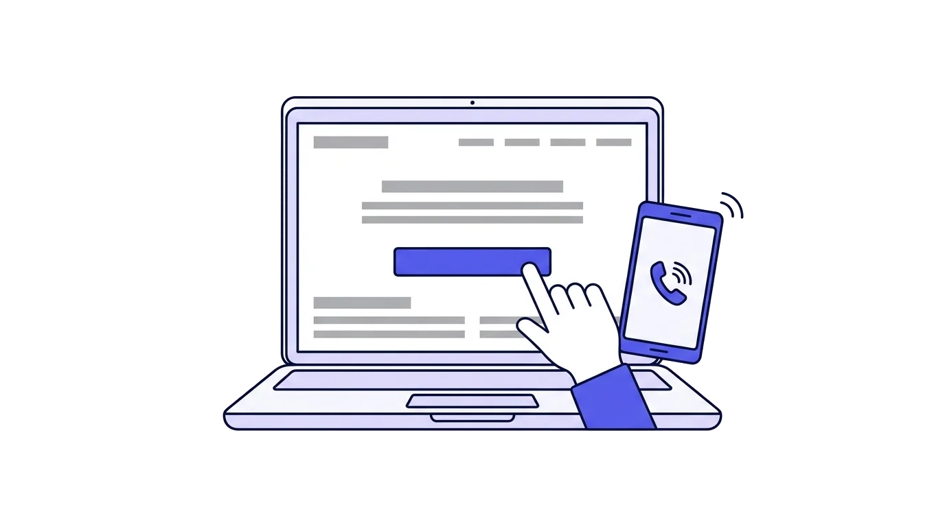
Most business owners whose website brings no leads conclude they are short of traffic, and pay for more advertising. Often the traffic is already there. People arrive, look for a few seconds and leave, because something on the site held them up, confused them or made them think the business might no longer be active. A visitor who came from Google or from a ChatGPT recommendation is already interested, and every delay gives them a reason to go back to the list and try the next name.
The mistakes here are ordered the way a visitor meets them: from the moment the page loads, through what they look for on it, to what happens after they have already sent an enquiry.
A five-minute check
Before anything else, look at the site the way a customer sees it. It takes five minutes and exposes most of the problems.
- Open the site on your own phone, on mobile data rather than the office Wi-Fi.
- Try to find three things within 30 seconds: what it costs, which areas you cover, and how to get in touch.
- Fill in the contact form to the end, as a customer would.
- Check that the enquiry arrived, by email or wherever it is meant to go, and how long it took.
- Ask two people who don't know the site to do the same while you watch without helping.
Whatever got you or them stuck is the place to start.
Speed and the phone screen
Most visitors arrive on a phone, and a site built and checked on a computer can look completely different on a small screen.
- The page loads in under three seconds. Check speed for free in Google's PageSpeed Insights, which gives separate scores for mobile and desktop and lists what slows the page down.
- Images are resized to the size they are shown at. A photo taken on a phone and uploaded as it is, is the most common reason for a slow site.
- There are no old plugins nobody uses. Every plugin adds code the browser has to load.
- Text is readable on a phone without zooming.
- Buttons are big enough to tap with a thumb, and far enough apart.
- Nothing is cut off, spills to the side or needs sideways scrolling.
Interruptions on arrival
The first seconds decide whether the visitor stays. Anything that covers the content before they have read a word is a reason to tap "back".
- No pop-up asks them to sign up for a newsletter or claim a discount the moment they arrive.
- No video plays on its own with sound.
- The cookie notice doesn't cover half the screen on a phone.
- The chat window doesn't open by itself over the content. A small button in the corner is enough.
The information customers look for
A customer who can't find the answer to a basic question won't call to ask. They will move to a site where the answer is written. The same information also helps AI assistants, as explained in the guide to ChatGPT recommendations.
- The phone number appears on every page, as a link that dials on tap rather than text to copy.
- There is a button that opens a WhatsApp chat. In Israel many customers prefer to write rather than call.
- It says which areas you cover, or what the address is if customers come to you.
- There are prices, or at least a price range and what moves it. A visitor who finds no price assumes it is high.
- Opening hours are written, and match the ones on the Google business profile.
- It says what happens after getting in touch: how soon you reply, whether there is a visit before a quote, and whether it is charged.
Signs of trust
A visitor doesn't know you, and decides whether to trust you from small details, some of them without noticing.
- Customer reviews appear on the site itself, with a first name and a detail about the job, not only on Google.
- Photos show the real staff and real jobs. Stock photos are spotted quickly and suggest there is nothing to show.
- Licences, certifications or membership in a professional body appear, if there are any, with a number.
- The site is secure, with no "Not secure" warning next to the address in the browser. The warning appears when a site has no security certificate, and most hosting companies install one for free.
- The footer shows the current year, not 2021.
- There is no abandoned blog. A last post from two years ago makes visitors think nobody maintains the site, and maybe not the business either. If there is no time to write, it is better to take the blog out of the menu.
- The full business name and business or company number appear. A business that doesn't hide its details looks more trustworthy.
The moment of getting in touch
The moment a visitor has decided to get in touch is the easiest one to lose, because any obstacle there comes after everything else has already worked.
- A contact button appears at the top of every page, without scrolling. On a phone it should stay pinned to the bottom of the screen while scrolling.
- The form asks only for what is needed to call the customer back: name, phone and what they need. A form with 10 fields stays empty.
- The button says what will happen when it is tapped: "Book an appointment" or "Get a quote", not "Learn more" or "Submit".
- After sending, a thank-you page says when you will get back to them. "We'll call you by 12:00 tomorrow" reassures. A bare "Thank you" leaves the customer wondering whether the message arrived.
- The customer receives a confirmation by email or message, with the details they filled in and a way to reach you if it's urgent.
Navigation and headlines
A visitor who can't tell within a few seconds what the business does and whether it is for them won't start searching.
- The main headline says what the business does for the customer, and where. "Solar water heater repairs in Gush Dan, same day" works better than "Over 20 years of experience and professionalism".
- The menu has up to six or seven options. A menu with 12 leaves the visitor without direction.
- Every main service has its own page, rather than one long list of everything.
- No links lead to an error page. Go through the menu and buttons every few months, especially after a change to the site.
The lead arrived, now what
Some leads are lost not on the site but after it. In a check of businesses receiving enquiries through a website form, almost half of the enquiries got no response at all, and the first reply took almost 18 hours on average. A customer who hasn't heard from you by evening has already spoken to someone else.
- Respond within an hour during working hours, and the next morning for evenings and weekends.
- Check once a month that the form really arrives. Send an enquiry to yourself and see that it came in and didn't land in spam.
- A missed call gets a call back. A number that rang and left no message is still a customer who was looking for you.
- Whoever calls customers back knows what the customer already wrote in the form, and doesn't ask everything again from the start.
Accessibility
An accessible site is easier for every visitor, not only people with disabilities: text that can be enlarged, good contrast between text and background, descriptions for images, and forms that can be filled in without a mouse. In Israel a site that serves the public generally has to meet the accessibility regulations and display an accessibility statement, with exemptions and relief for some small businesses. Check what applies to your business before someone else checks for you.
A plan for the month
There is no need to build a new site. In most cases a few small fixes change the number of leads more than a redesign does.
- Week one: the five-minute check, and making sure the form arrives.
- Week two: a tap-to-call phone number, a WhatsApp button, and a contact button at the top of every page.
- Week three: prices or a price range, a service area, and a thank-you page that says when you will call back.
- Week four: speed on mobile, mainly resizing images and removing plugins that aren't in use.
- From then on: respond to every lead within an hour, and check the site again once a quarter.
Common questions
Why does my site get visits but no leads?
Usually because something holds the visitor up: the site is slow on a phone, there is no price or service area, the contact button can't be seen, or the form is too long. Check the site on a phone, on mobile data, and try to get in touch the way a customer would.
How many fields should a contact form have?
Three are enough for most businesses: name, phone and what the customer needs. Every extra field is a reason to give up halfway, and the rest can be asked on the call.
How quickly should I respond to a lead from the website?
As fast as possible, ideally within an hour during working hours. In a check of businesses receiving leads through a form, almost half of the leads got no response at all, and the first reply took almost 18 hours on average. A customer who hears nothing contacts a competitor.
How do I check how fast my site loads?
Enter the address into Google's PageSpeed Insights, which gives separate scores for mobile and desktop and lists what slows the page down. Check by hand too, on a phone and on mobile data.
Do I have to make my website accessible?
In Israel a site that serves the public generally has to meet the accessibility regulations, with exemptions and relief for some small businesses. Check what applies to yours, and an accessible site is easier for every visitor anyway.